Old School Float Layout
float places an element to the left or right side of its container, allowing inline elements to wrap around it.
clear can cancel float.
<style>
* {
margin: 0;
padding: 0;
}
#wrapper{
margin: auto;
width: 90vw; /* Viewport Width = browser window width */
}
#top{
height: 10vh; /* if Viewport Height is 50cm, 1vh = 0.5cm (or 1%) */
background-color: aqua;
}
#middle {
overflow: hidden; /* enable the -10000px bottom margin height hack below... */
}
#left_col{
width: 150px;
background-color: greenyellow;
float: left;
margin-bottom: -10000px; /* this doesnt make column heights the same size... */
padding-bottom: 10000px;
}
#mid_col{
/* 100% of #wrapper - #leftcol - #right: */
width: calc(100% - 150px - 100px);
background-color: violet;
float: left;
margin-bottom: -10000px; /* it just gives column heights illusion of same size... */
padding-bottom: 10000px;
}
#right{
width: 100px;
background-color: sandybrown;
float: left;
margin-bottom: -10000px; /* which usually suffices. there are better ways. */
padding-bottom: 10000px;
}
#footer{
clear: both;
height: 5vh;
background-color: lightgray;
}
</style>
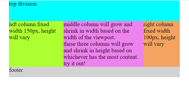
<div id="wrapper">
<div id="top">top division</div>
<div id="middle">
<div id="left_col">left column fixed width 150px, height will vary</div>
<div id="mid_col">
middle column will grow and shrink in width based on the width of the viewport.<br>
these three columns will grow and shrink in height based on whichever has the most content. try it out!
</div>
<div id="right">right column fixed width 100px, height will vary</div>
</div>
<div id="footer">footer</div>
</div>
read up on calc() then try this:
- put some content into left, middle and right columns. what happened to their:
- widths
- heights