User Interface
The following user interface pictures were created entirely using Pencil Project for the layout / drawing of user interface controls, and (then) Microsoft Word for the textbox labels around the edges. Click to enlarge:
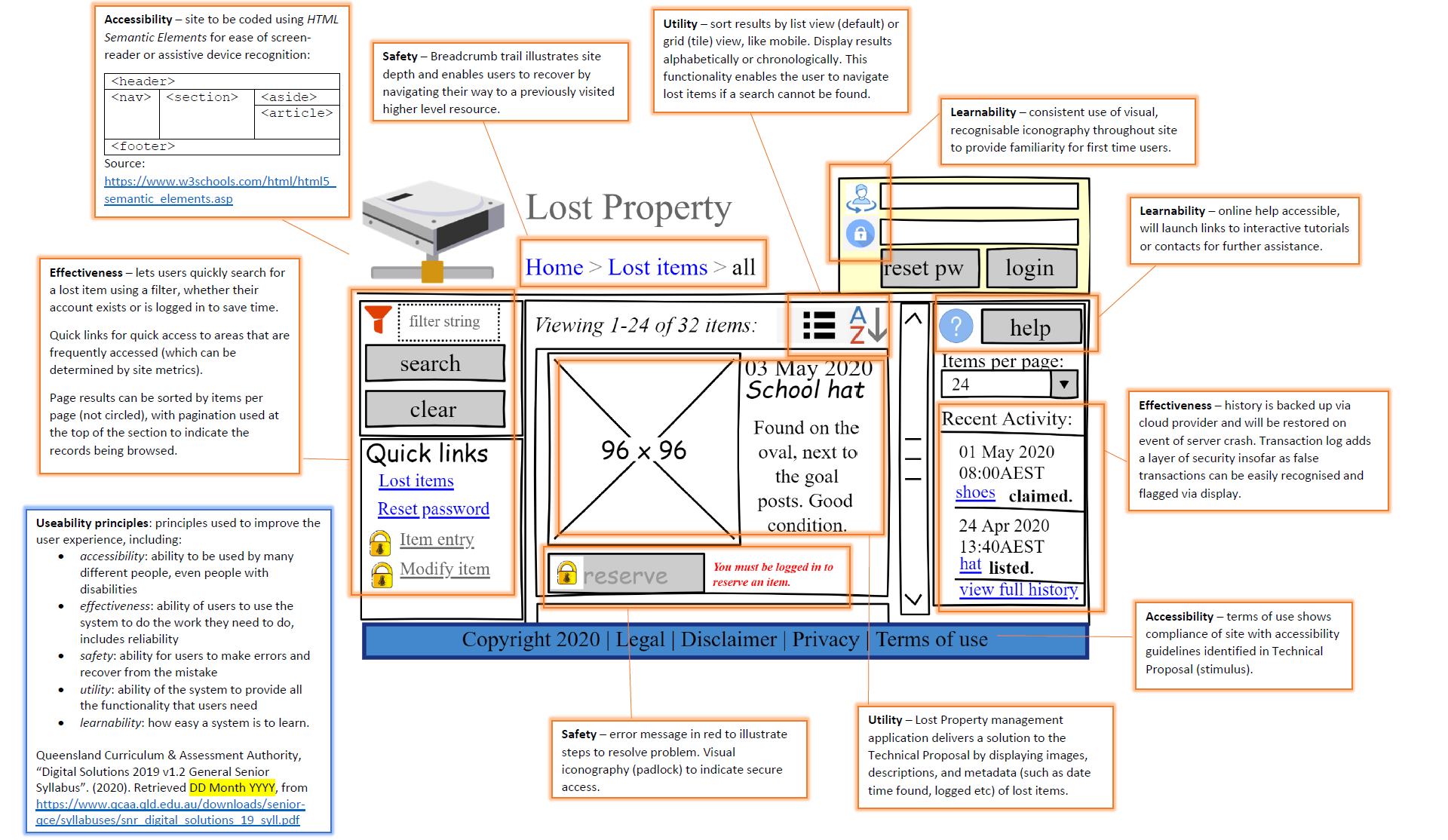
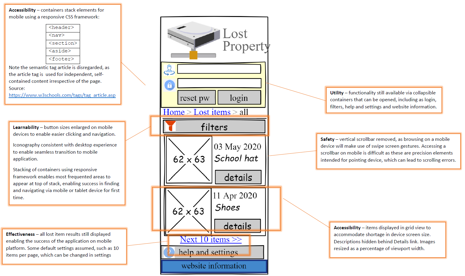
Useability principles - principles used to improve the user experience.
User experience - aspects that affect how an end user interacts with digital systems such as visual, interface and navigation design, user needs, and functional and content requirements; this is determined by improving the solution's useability based on the useability principles of accessibility, effectiveness, safety, utility and learnability.
When identifying Useability Principles, it is suggested that you do your own research and reading - start by Googling the principles listed below.
| Useability principle | Definition | What you could look for |
|---|---|---|
| accessibility | ability to be used by many different people, even people with disabilities |
|
| learnability | how easy a system is to learn |
|
| safety | ability for users to make errors and recover from the mistake - don't confuse safety with security |
|
| utility | ability of the system to provide all the functionality that users need | CAN IT DO SUCCESS CRITERIA?
|
| effectiveness | ability of users to use the system to do the work they need to do, includes reliability | HOW WELL CAN IT DO IT?
|
Explore and use the elements and principles of visual communication -
- elements are limited to space, line, colour, shape, texture, tone, form, proportion and scale
- principles are limited to balance, contrast, proximity, harmony, alignment, repetition and hierarchy
| Design element | Definition |
|---|---|
| Space | Used to support meaning or zone groups of data (i.e. space between elements). Used consistently to develop predictability |
| Point | Smallest element of visual communication, can be a dot but not necessarily circular |
| Colour | Choice of colour matters. Be consistent throughout application, and make sure colours chosen are compatible with each other (perhaps use a colour wheel) |
| Tone | Tone is light or dark variation of any colour |
| Line | A line can be a starting place, a marker or trigger to change |
| Shape | Shapes can use lines (straight or curved) to develop two-dimensional zoning and the implied boundary of an object. Shapes are good for conveying structure around data. The simplest form of shapes with data is a table. Shapes could also be a circular icon to centre a user to a record button on a phone |
| Texture | Texture refers to the tactile or inferred visual features of an object |
| Form | Can give depth |
| Proportion and scale | Ratio and size. Look for the "Golden Ratio". In mathematics, two quantities are in the golden ratio if their ratio is the same as the ratio of their sum to the larger of the two quantities |
| Design principle | Definition |
|---|---|
| Balance | Arrangement of components of a visual communication in relation to a real or implied central axis / equilibrium / symmetry |
| Contrast | Contrast refers to opposing aesthetic qualities (i.e., what you see when you compare things that are different) and can be used for to create emphasis or focal point |
| Proximity | Where elements are positioned or grouped in relation to each other, perhaps 'clumping' elements near each other that have a perceived relationship (or avoiding those that don't) |
| Harmony | Interpreting the proximity to make sure components as a whole provide valuable meaning and are complementary across the interface. For example, sometimes it is better to split datasets across screens for example to avoid confusion |
| Alignment | Elements should 'line up', commonly used in HTML sign up forms |
| Repetition | Repeated elements (such as page constructs, sections or product layouts) which helps predictability |
| Hierarchy | Hierarchy refers to the 'reading order' of a design |